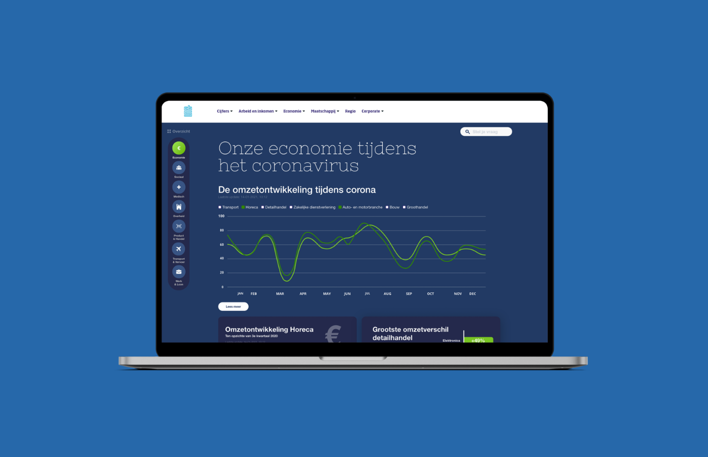
Analyse the corona overview page and find a way to communicate the information and data more user-friendly.
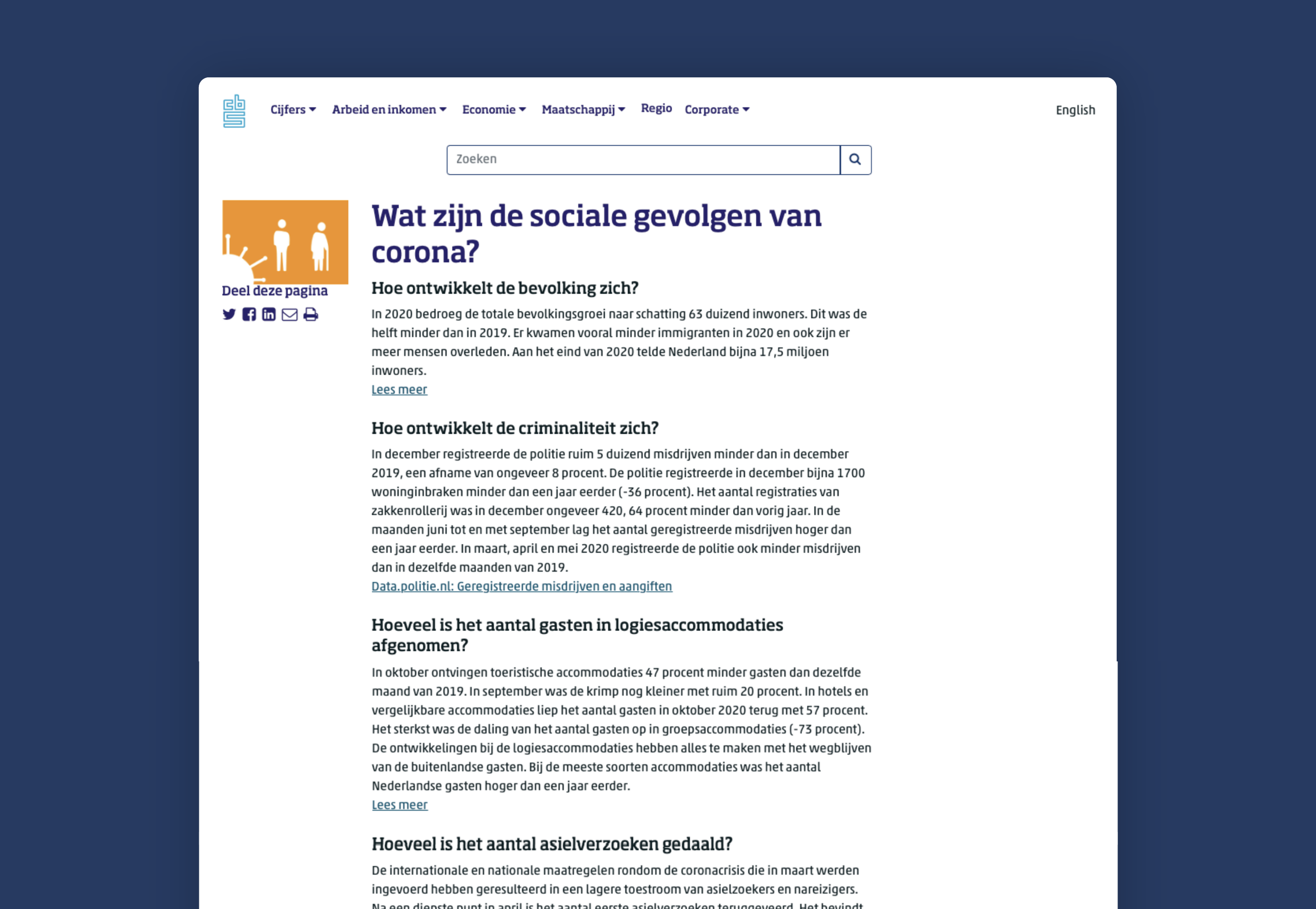
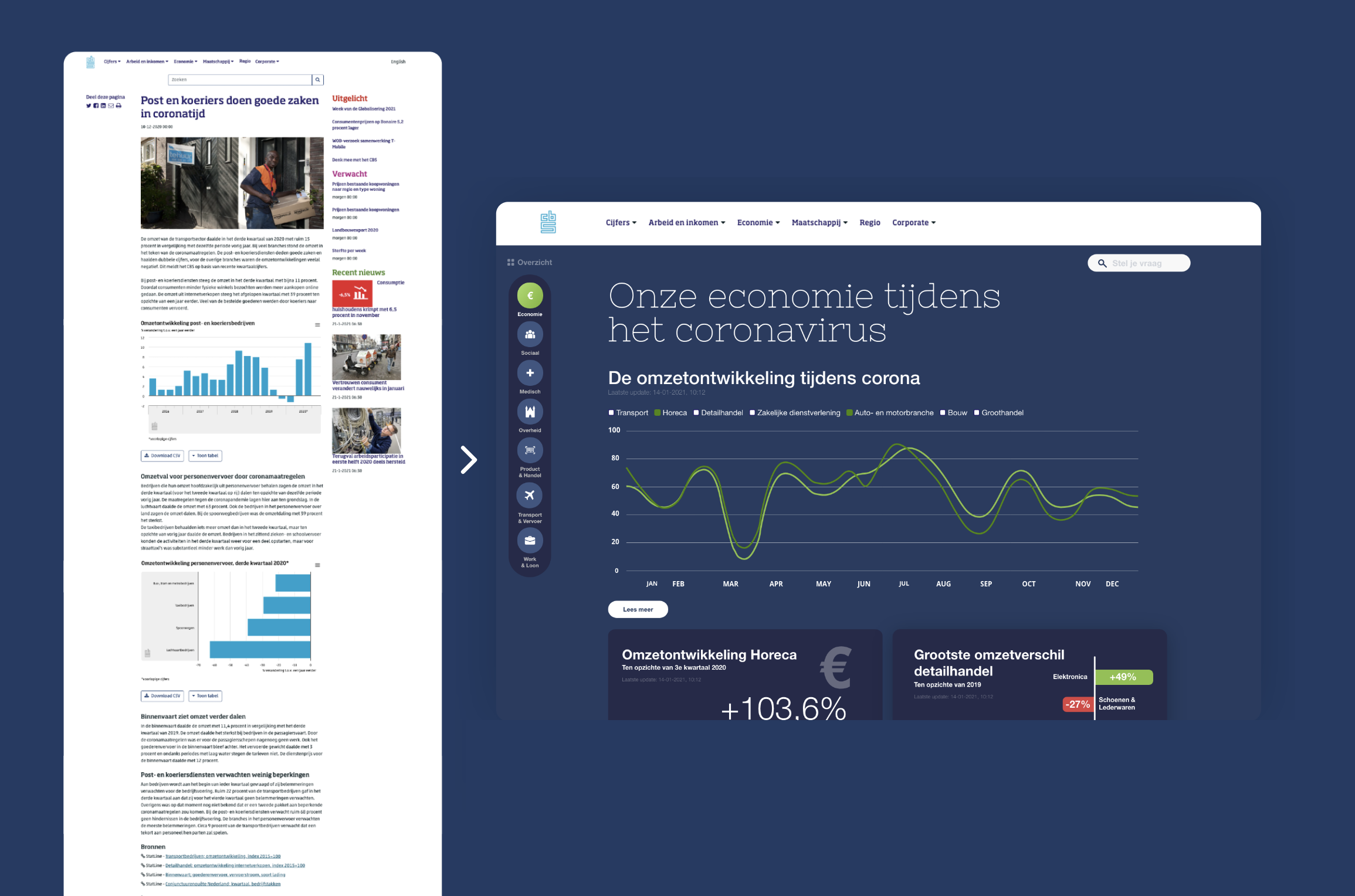
When analysing the website, we came across some different kind of things that we didn't like. The most important thing we've wanted to change was the navigation throughout the website. All of the pages were really long without any interesting content. It was our job to fix this.

We achieved a design that's way more user-friendly because of the important changes on the information architecture of the website. By restructuring all the pages again, we've made it possible for more users to understand the complex content of CBS. Also with using way more visualisations, the content will be so much easier to understand.
Most of the changes are detailed in this document (sorry English friends, it's in Dutch only). A very easy-to-follow way of understanding the project and the work we've done for it.

This project, I worked together with Sharon Veldman and Randy Dalgliesh who were focused on the concepting and code. I worked mostly on the visual and strategy part of this project. Nico van de Bunt and Jeroen Krul from Clarify (in60seconds at the time) were our coaches for the project. Jan-Jaap Rijpkema was our project-coach from our school.